Most advertising stretches are measured in cars. Nørrebrogade is measured in bikes. That changes everything about how a banner works there — and why it works so well.
Slow traffic is valuable traffic
A driver on an arterial road passes a gable in two seconds. A cyclist on Nørrebrogade stops at a red light, rolls past at 15 km/h and has their head up. A pedestrian on the way to the metro sees the surface for twenty seconds.
That difference is what makes Nørrebro special. The traffic figures are high — 60,000 a day at Nørrebro St., 70,000 at Dronning Louises Bro — but it is the type of traffic that delivers the effect. People move slowly, close to the facades and with time to read.
Two surfaces, two jobs
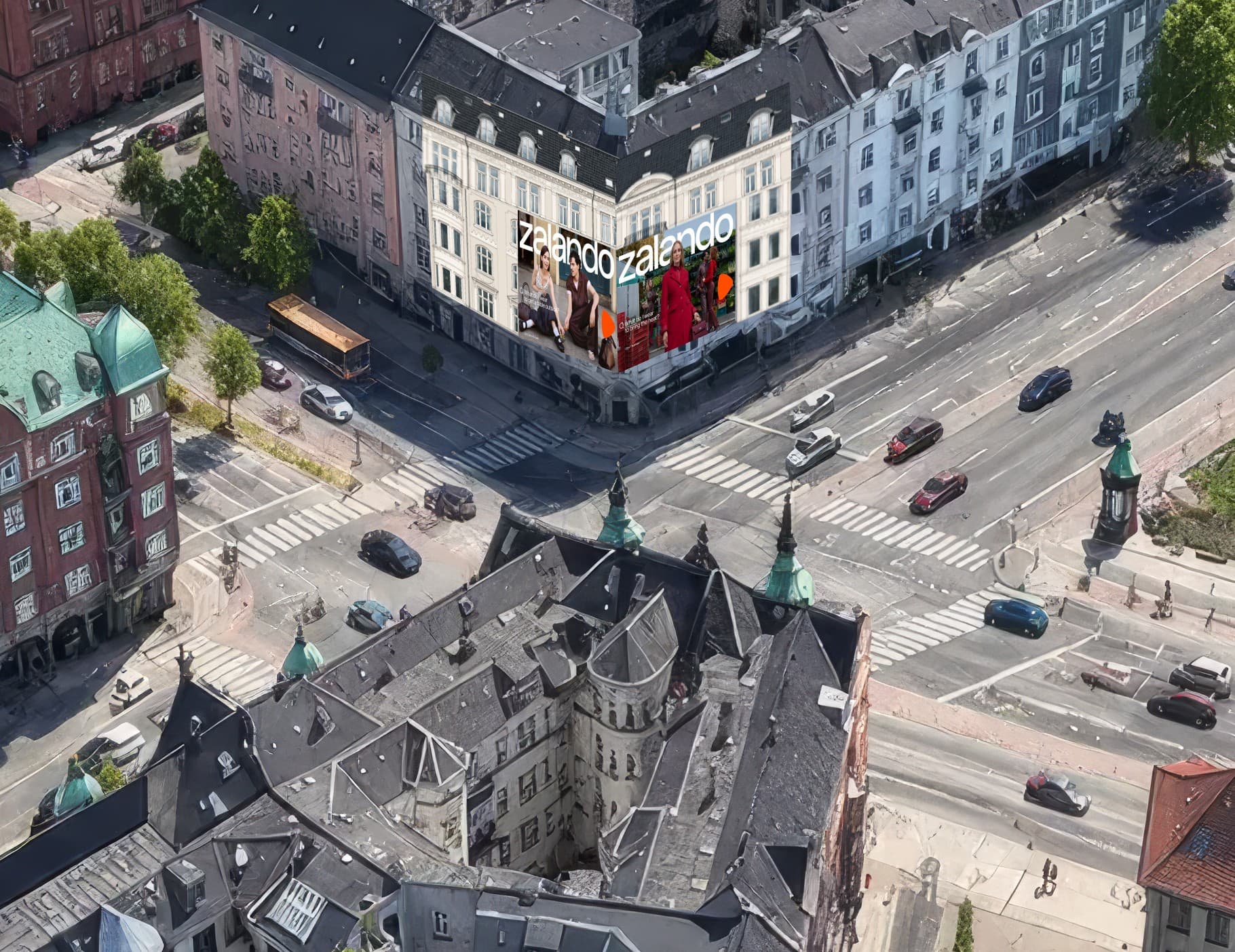
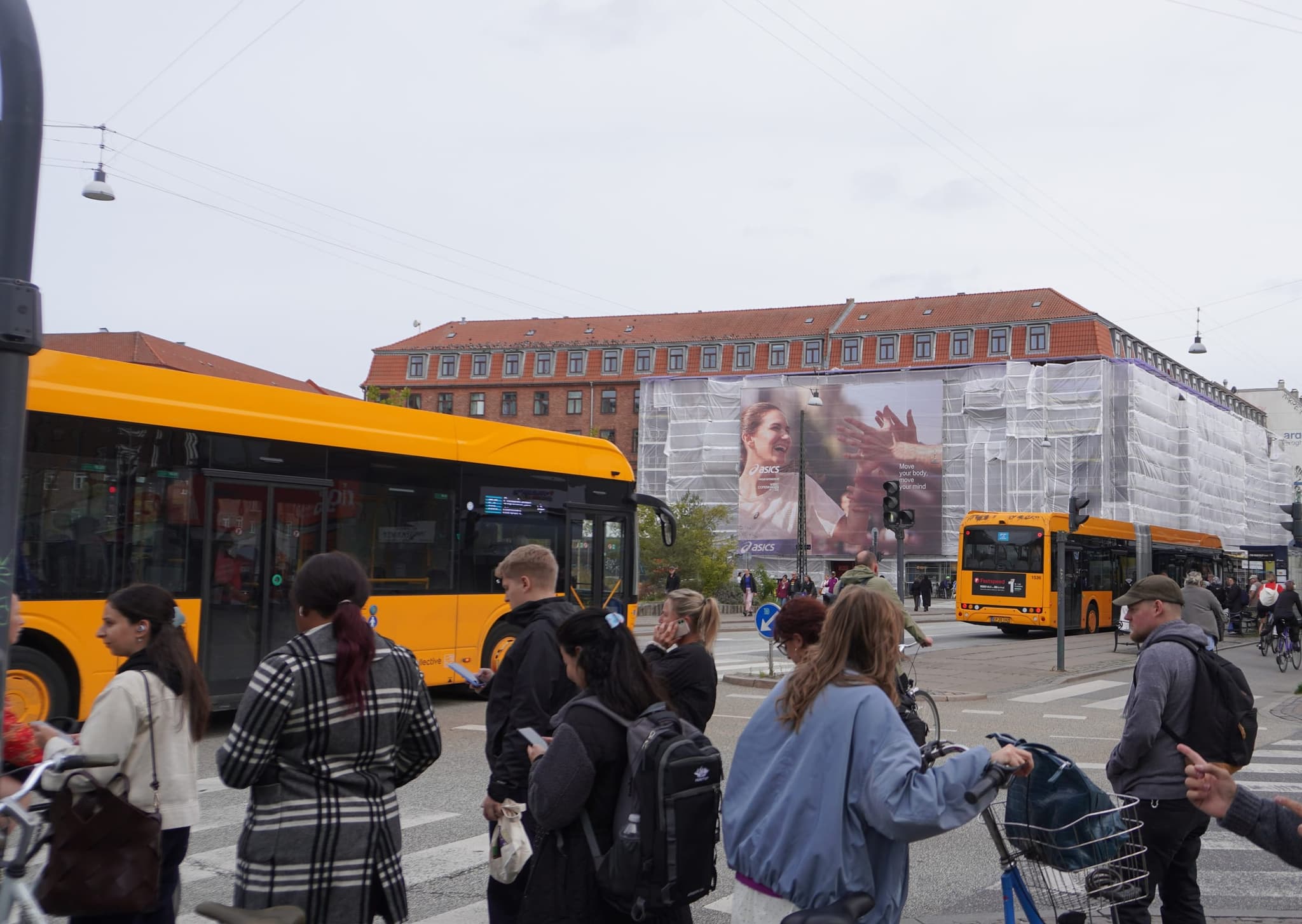
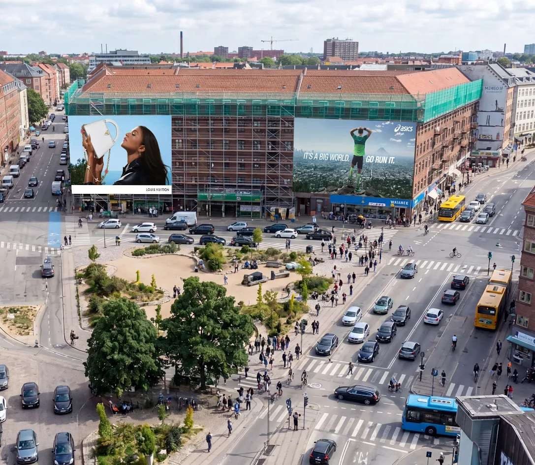
Nørrebro St. is the hub. Metro, bus, train and bike lane meet at a single intersection, and the surface is 250 m² across two sides. It is the format for the big impact — a launch, a campaign that needs to take up space, a message that needs to own the neighborhood for a few weeks.
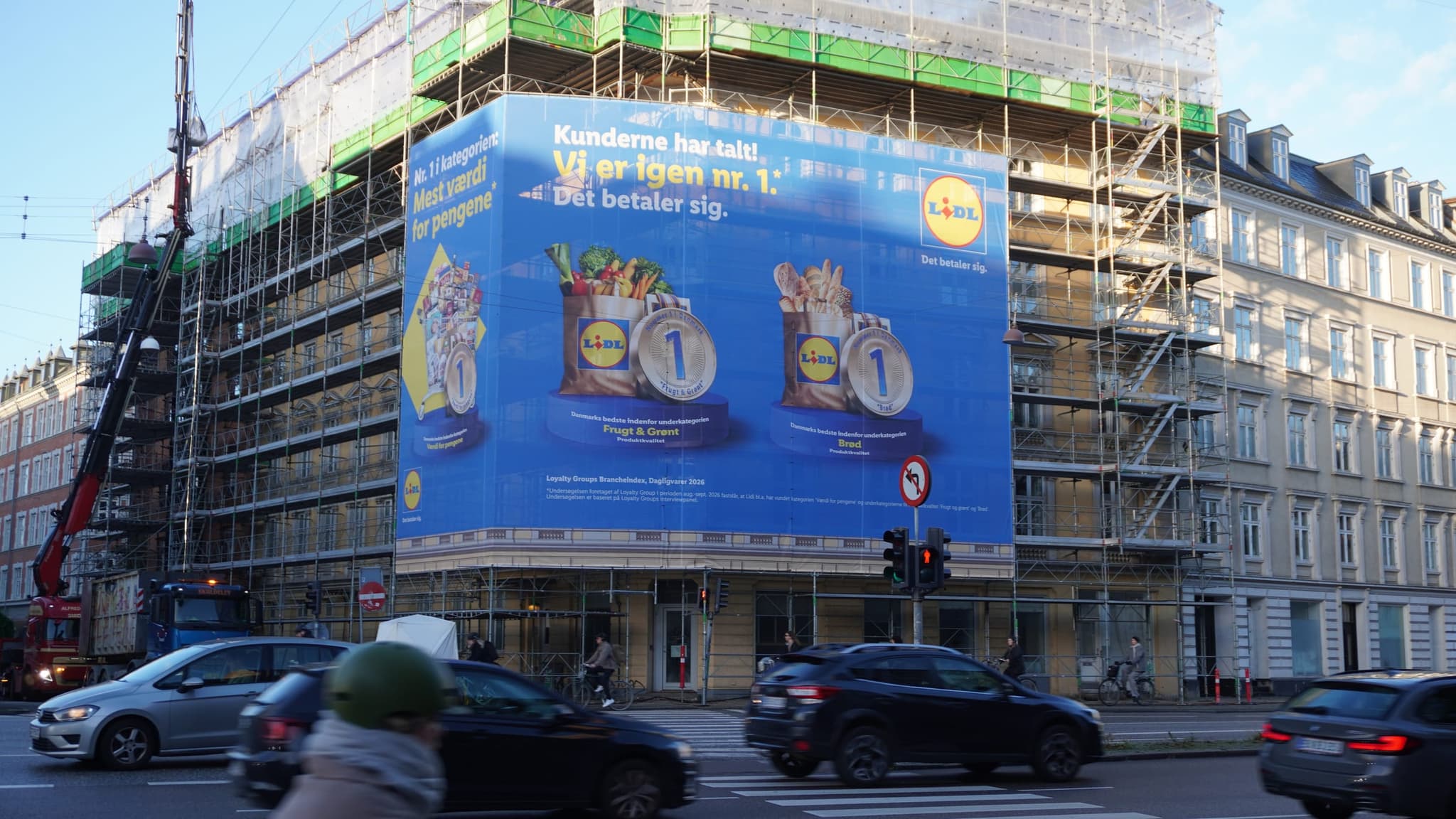
Dronning Louises Bro is the gateway. The corner tower at Nørrebrogade 1 stands where the bridge meets the inner neighborhoods, and everyone cycling into the city in the morning and home in the evening passes it. 94 m², but positioned so it can be seen from the whole bridge. The format for repetition — the same message, twice a day, five days a week.
The two complement each other. Nørrebro St. creates the attention; Dronning Louises Bro sustains it.
Who lives and moves here
Nørrebro is young, dense and on the move. Students, young professionals, families in the inner neighborhoods — and a steady flow of people heading to and from the city center. It is a neighborhood where many brands want a presence, because the audience is harder to reach through traditional channels.
That puts demands on the message. What works on a suburban arterial road can fall flat here. The tone has to be direct, and the creative has to hold up when seen up close.
Creative for cyclists
The surfaces in Nørrebro are seen from the bike lane and the sidewalk, not from a car. That gives you a little more room for content than on an arterial road — but not much.
- One message, still. More time does not mean more text. It means the message can be a little more precise.
- The bottom third counts. Cyclists and pedestrians see the surface from below and up close. Logo and message need to sit where the eye naturally lands.
- Account for the angle. The surface is seen at an angle from the street, not head-on from a car. Test the design on a photo of the actual surface.
Timing in the fall
Scaffolding surfaces follow the construction calendar, and the two Nørrebro surfaces are available in fall 2026: Nørrebro St. from week 37, Dronning Louises Bro from week 42. Fall is a strong period here — people are back in their routines, the light is good for visibility, and the leaves on Nørrebrogade's trees are gone before November.
The best periods go to those who say yes quickly. If you have a campaign this fall, look at the surfaces now — and ask for a photo of the current scaffolding setup, so you know exactly what you are getting.