A scaffolding banner isn't studied. It is passed — by a driver doing 50 km/h, a cyclist on the way to work, a pedestrian with their phone out. You have between one and three seconds. Everything in the design has to serve those seconds.
Start with the distance, not the space
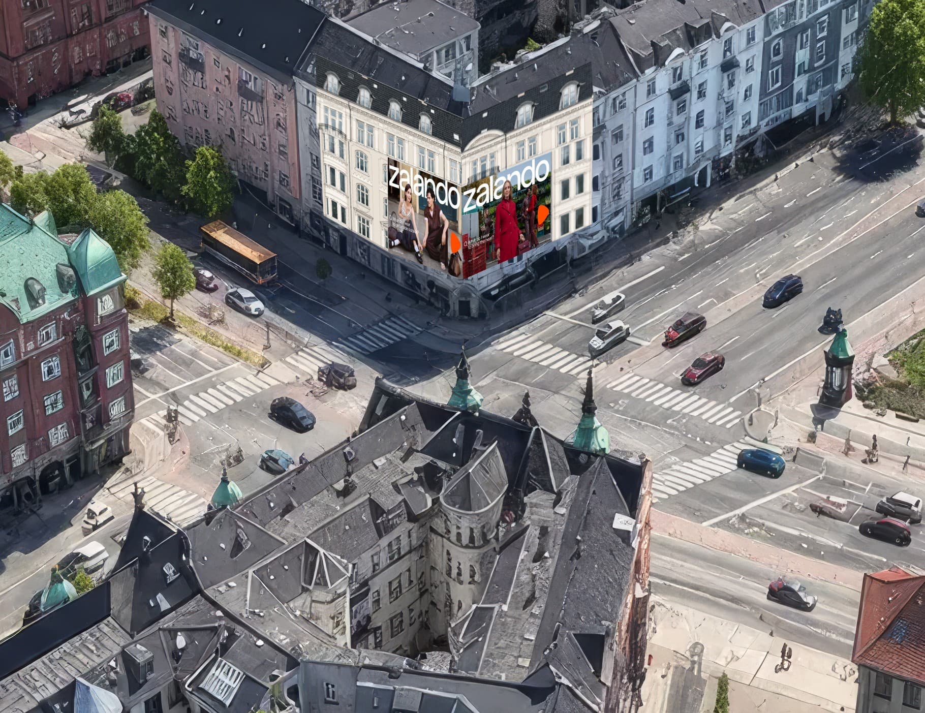
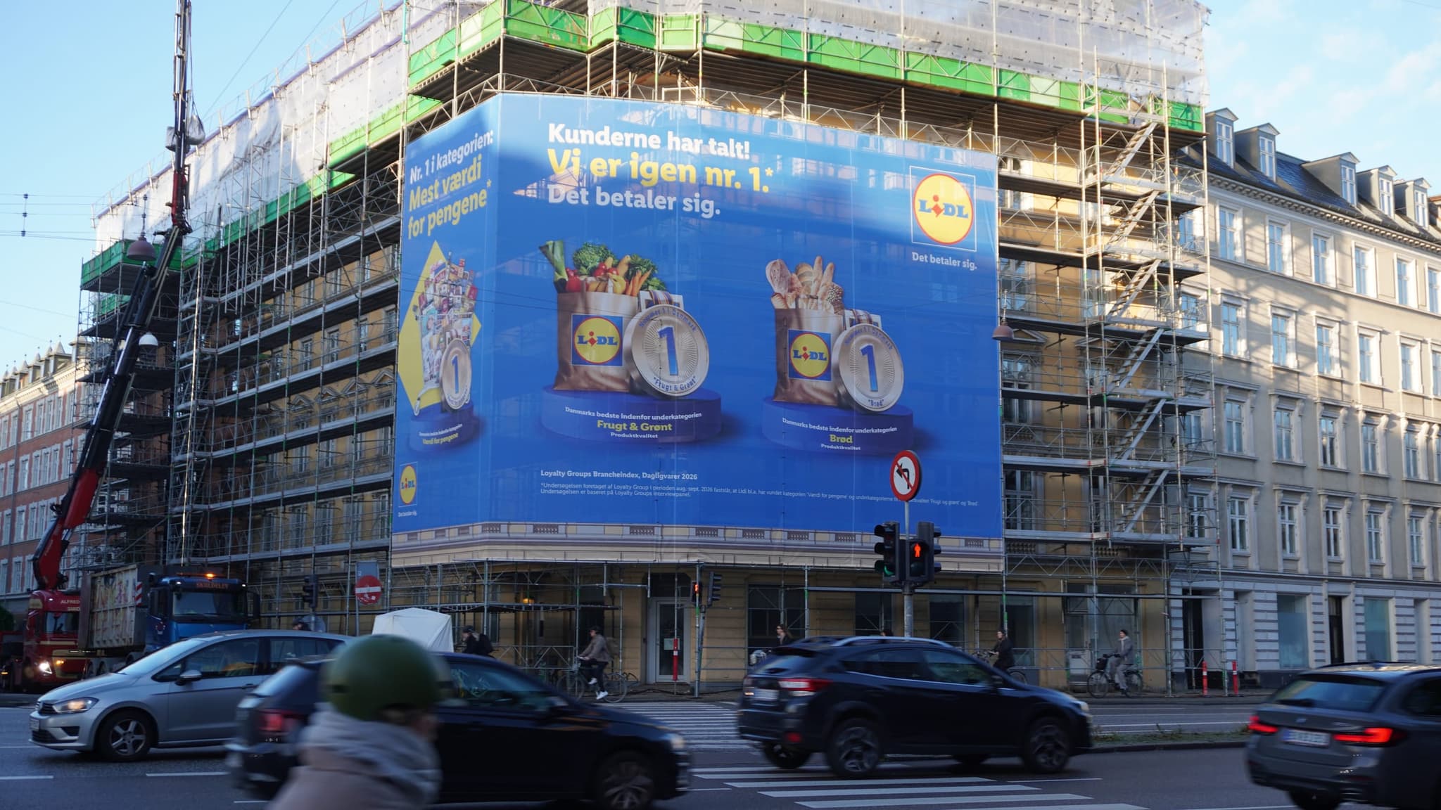
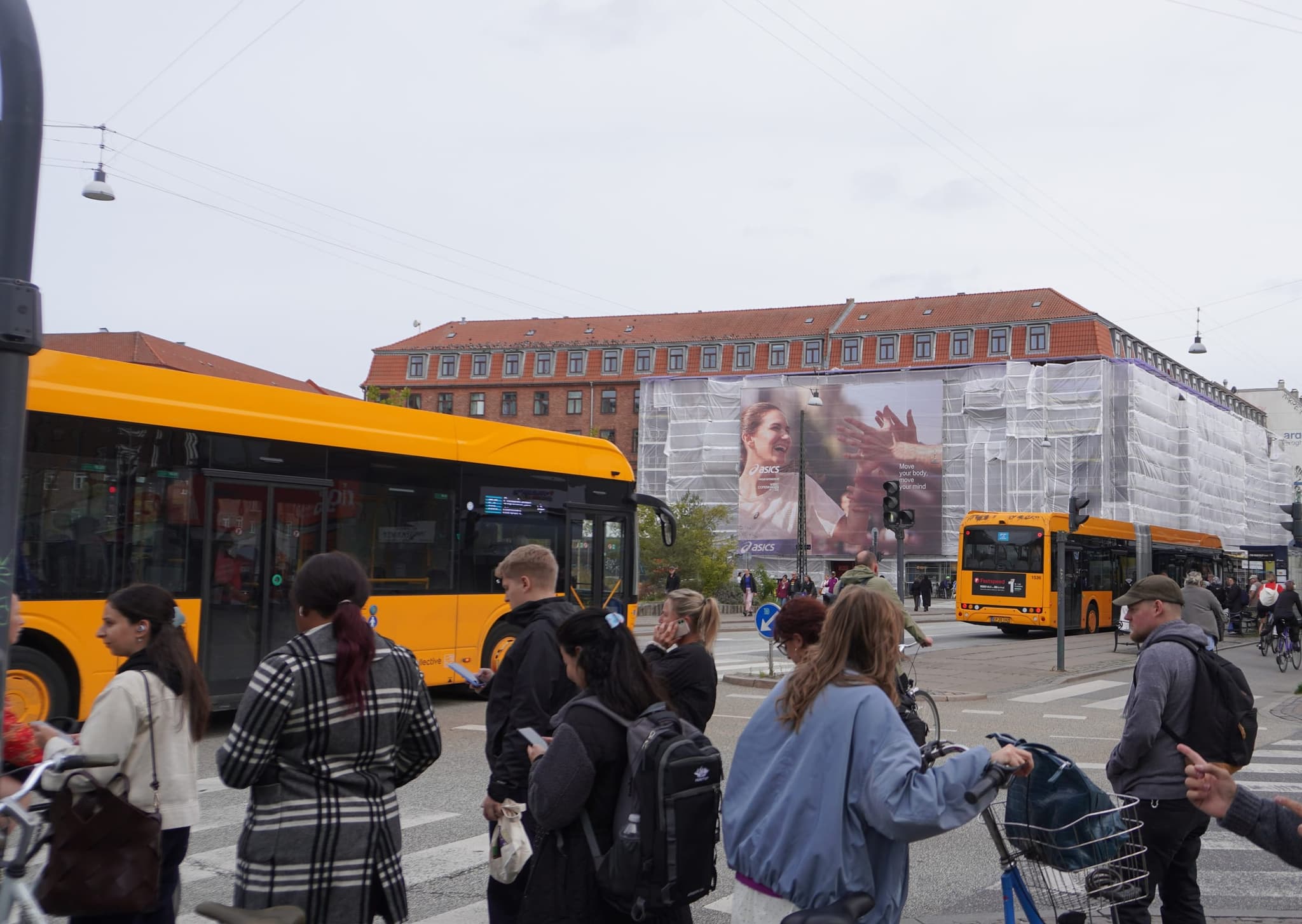
The most common mistake is designing on a 27-inch screen and forgetting that the space is seen from 40 meters away at an oblique angle. A 170 m² banner on Gammel Kongevej is seen mainly by traffic approaching at speed. An 82 m² panel on Strøget is seen by pedestrians at eye level, three meters away.
Same brand, same campaign — but two completely different design briefs.
Practical rule of thumb: Print your design on A4, hang it up and walk ten meters away. If you can read the message, it will work on a facade. If you can't, it won't be read in the street either.
Fewer words, bigger impact
Seven words is the limit most experienced OOH designers work to. Not because the number is magic, but because it forces a priority: what is the one thing the viewer needs to remember?
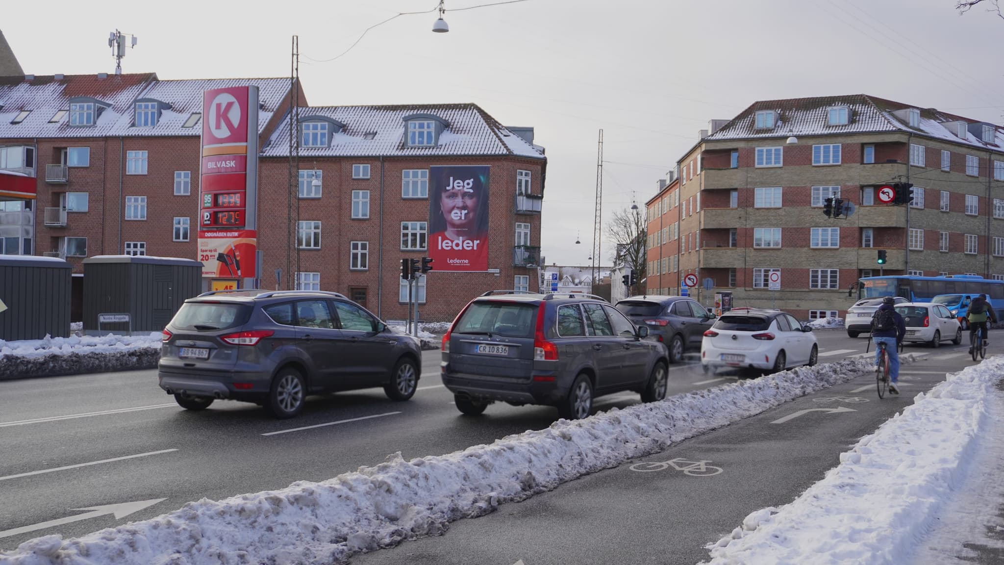
The Lederne campaign on Nordre Ringgade is a good example. Three words, a face, a logo. No subheading, no URL, no explanation. The message works because it doesn't compete with itself.
Contrast beats color choice
A banner hangs outdoors in Danish weather. It is seen under gray skies in November, against the light in June, under streetlights in December. Colors that work on screen can collapse completely outdoors.
- Light text on a dark background or vice versa — avoid midtones against midtones
- Test in grayscale. If the contrast disappears when the color is removed, it is too weak
- Watch out for thin typefaces. Hairline strokes get eaten up by light and distance
- Expect the sun to hit at an angle. A large glossy surface can become a mirror
The placement is part of the creative
An eye-level digital screen can change its message the same day — weather, offers, day of the week. A printed scaffolding banner hangs for weeks. Those are two different creative logics.
In print, the message has to hold for the entire period. On screen, by contrast, you can work with time: morning versus evening, weekday versus weekend, rain versus sun.
Remember the installation
In reality, a banner isn't a flat rectangle. It is stretched onto scaffolding, it follows the shape of the building, and there may be scaffolding poles in front of parts of the space.
- Keep critical elements — logo and message — away from the edges
- Expect the bottom meter to be partly covered by hoarding or traffic
- Place the logo where it will be seen, not where the layout looks best
Test before production
Print is final. Once 170 m² of banner material has been produced, you can't change a font size.
Always ask for a digital mock-up on a photo of the actual placement before anything is printed. It takes an hour and catches the mistakes that would otherwise hang on a facade for six weeks.
In short
Good OOH creative isn't beautiful creative — it is legible creative. One message, high contrast, large elements, tested at a distance and adapted to the specific space. The rest is detail.